
CASE STUDY
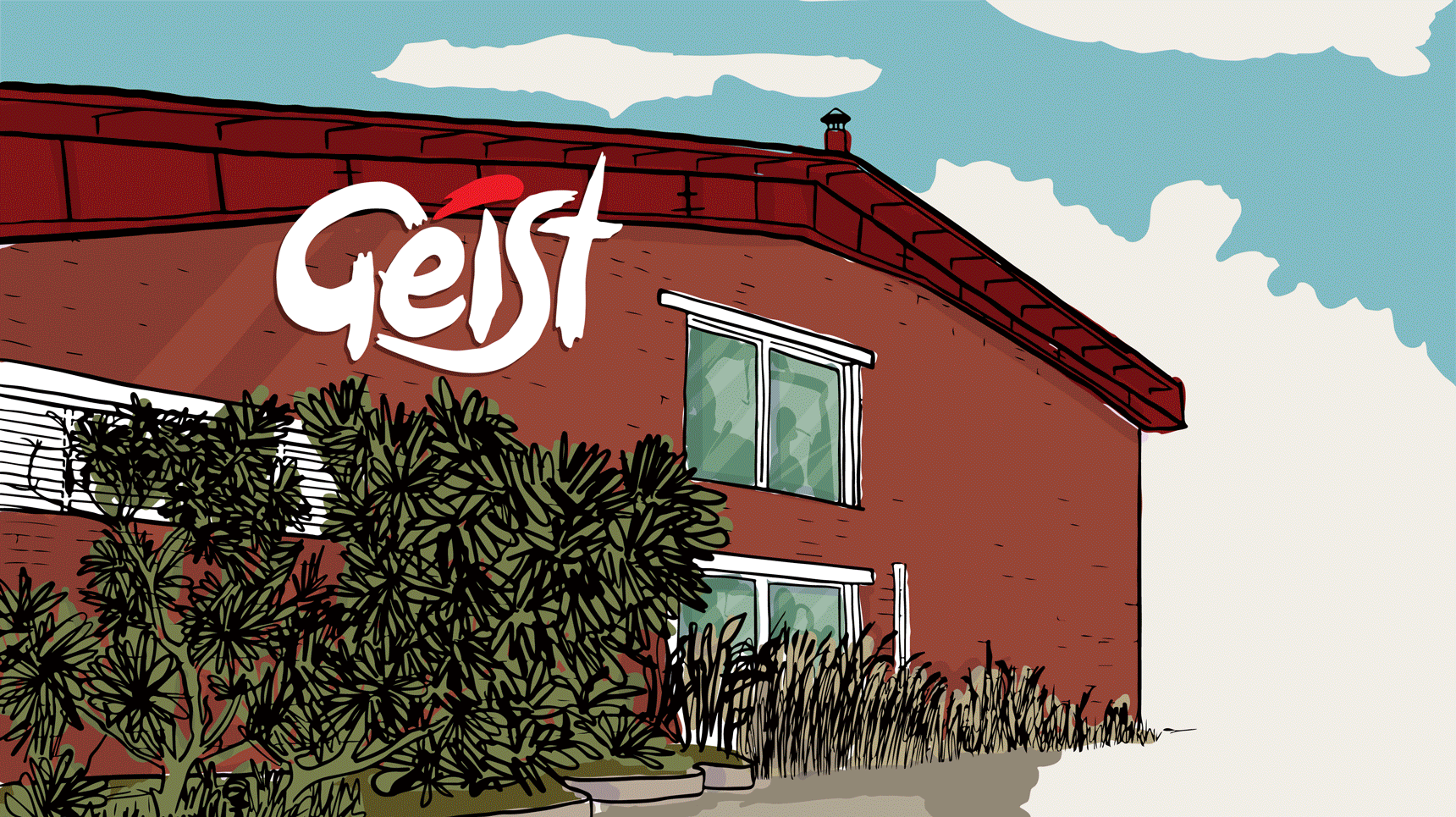
GEIST BREWING CO.
Archive of long-term brand design partnership with South India’s pioneering craft beer brewery
SERVICES
Creative direction, brand marketing, packaging, campaigns, digital content, hospitality design, and cross-functional collaboration as an embedded BRAND & DESIGN CONSULTANT within the brand marketing team
INDUSTRY
alco-bev, hospitality
4 YEARS, 10 MONTHS
December 2020 - September 2025
Buckle up, this is a long read. Five years of creative direction and brand stewardship for one of India’s most recognisable craft beer brands. This is by no means a chronological documentation of everything I worked on in this time (that would be insane). Let’s call it a highlight reel.
The Context
When I began working with Geist Brewing Co. in December 2020, the company was on the brink of a major transformation. Known initially for brewing and supplying draught-only craft beer to restaurants and pubs in Bangalore, the company was expanding rapidly: opening its own beer gardens, entering retail via packaged format, launching new beers, and building a customer-facing identity in a changing and competitive market.
PREVIOUS GEIST DESIGN LANGUAGE (PRE-2020)

The original brand identity (by Vinayak Varma) had served the company well in the early years. But as the business scaled across product formats, customer types, and cities, it became clear that the brand needed to evolve with it. It needed a stronger, more flexible system. It needed to feel like one cohesive voice rather than a collection of ad-hoc touchpoints. And it needed to feel unmistakably like Geist.
CURRENT GEIST DESIGN LANGUAGE


My Role
I worked with Geist Brewing Co. as an embedded consultant within the brand marketing team. Functionally, I provided ongoing creative direction and brand support across day-to-day brand marketing, campaign development, packaging design, web design, investor collateral, and content direction.
I worked cross-functionally with teams across marketing, product, hospitality, and operations. Where a capability didn't exist in-house, I identified and commissioned external collaborators – photographers, content creators, web developers, muralists, animators – and led the briefing, direction, and final output.
While the company’s Chief Brand Officer, Geetanjali Chitnis, with whom I worked closely, was instrumental in shaping the brand’s trajectory, I played a role alongside in cultivating its visual voice, consistency, and systemisation. It was an ongoing, collaborative effort – and one of the most significant brand relationships in my practice.
My focus was on:
-
Building a scalable design system that supported the company’s business goals
-
Ensuring brand consistency across physical and digital environments
-
Designing packaging systems for flagship and limited-release beers
-
Campaign development and directing creative output across media
-
Supporting hospitality growth through visual identity, environmental graphics and wayfinding signage, and customer experience touchpoints
-
Helping the brand stay true to its values while expanding to new cities and audiences

Growing the Brand with the Business
Since 2020, Geist Brewing Co. has expanded from a production-first operation into a dynamic brand with retail and hospitality presence across Bangalore, Hyderabad, and Pondicherry. The company now operates three hospitality locations in Bangalore, supplies craft beer in kegs to restaurants and pubs across 3+ cities, and retails packaged craft beer across 3+ cities.
To match this growth, the brand identity evolved:
-
From a single-format product to a multi-format, multi-audience brand
-
From a production-first business to a consumer-facing brand with character and clarity
-
From a small set of guidelines to a robust yet flexible, campaign-ready design architecture

BRAND & DESIGN GUIDELINES (click to view)

PHOTOGRAPHY GUIDELINES (click to view)
A Selection of Work
My work over the years was focused on building a scalable structure that could support:
-
Multi-format packaging (core range, limited releases, collaborations)
-
Multi-channel marketing (digital, print, in-venue, outdoor)
-
New city launches and geographic expansion
-
In-venue experience (menus, signage, visual tone, event graphics)
-
Campaign work, retail storytelling, and product-focused brand content
Packaging Design

GEIST REPEAT STRONG
Packaging and campaign design for a flagship export-style craft lager that marked Geist Brewing Co.’s entry into a new category of premium-plus beers.
Geist Repeat Strong was created for the everyday craft drinker: urban, aspirational, and easygoing. The kind of person who enjoys well-made things without needing to perform their taste. The brief was to design something that felt familiar to those used to commercial lagers, but in a way that still reflected the brand’s craft-first sensibility.
This beer was conceptualised as a Dortmunder Export-style lager, brewed to a higher strength, balancing rich malt character with floral hops and a clean, drinkable finish. This was the company's step into the premium-plus category, expanding its flagship range and bridging the gap between craft beer enthusiasts and commercial lager drinkers. It was also a few technical firsts for the brand: the move from cold-chain to ambient logistics, from sticker labels to pre-printed cans. The design therefore had to work within strict technical and manufacturing constraints while still feeling effortless and true to Geist Brewing Co.’s visual DNA.
Over two years of development, as the beer evolved through pilot batches, I adapted the design in parallel with the brewing and marketing teams. The result was a can that mirrored the beer itself: uncomplicated, unchallenging – simply well-made. The black-and-gold palette conveyed confidence and familiarity, the kind of design language that feels premium without shouting about it.
I also designed the packaging for the 24-pack carton, extending the identity system into distribution and retail touchpoints. Together, these elements formed a visual language that felt contemporary and recognisable, positioning Geist Repeat Strong as an approachable entry point into craft beer for mainstream drinkers.
Alongside the extended brand marketing team, I was deeply involved in developing and executing the campaign that introduced the product to market – from concept refinement to visual language and rollout. I also designed the launch communication and creative assets around the product message “Every day we win,” a line that celebrated micro-victories and ordinary joy – surviving Mondays, meeting a deadline, remembering to call your mom back. The campaign intentionally rejected the drama or occasion of drinking as a celebration of big, cinematic achievements, instead positioning this beer as a reward for the small, everyday efforts that add up.
This tone carried into all launch and promotional assets:
-
Promotional content direction: a mix of bold typographic layouts, wit, and slice-of-life photography
-
Retail and HoReCa material: posters, standees, coasters, and on-premise display kits
-
24-pack carton and promotional print: designed to extend the core identity into distribution touchpoints
Everything about the campaign was built to feel casual yet deliberate.
The release of Geist Repeat Strong marked a significant milestone for the brand – a flagship lager that expanded its audience without compromising its craft values, reaffirming Geist Brewing Co.’s belief that great beer doesn’t need to be complicated to be celebrated.
Look for my name on the back of the can. :)


AMRUT X GEIST BREWING CO.
Packaging design for a limited-edition stout-finished whisky – a collaboration between two of Karnataka’s most celebrated alcohol brands, Geist Brewing Co. and Amrut Distilleries.
This release was the result of a true back-and-forth: Geist Brewing Co. aged a stout in ex-Amrut whisky barrels, and once the beer was ready, those same barrels were returned to Amrut, who then aged a single malt whisky in them. The outcome was a bold, complex spirit that embodied the craftsmanship of both brands and the cyclical nature of collaboration.
The packaging design drew inspiration from the Mysore silk saree, a textile deeply tied to Karnataka’s cultural heritage. Its elegance, local craftsmanship, and timeless appeal made it the perfect metaphor for this partnership. A raw silk texture formed the base, visually suggesting that the whisky itself is “smooth as silk.”
A gold zari-style border framed the design, echoing the intricate weaving patterns of traditional sarees, while balancing the category’s masculine cues with cultural authenticity. Within the border, three bespoke motifs paid homage to Karnataka’s history and spirit:
-
Kempegowda’s tower, representing vision and endurance
-
Mysore Dasara elephants, evoking grandeur and tradition
-
The Kodava Peeche Katti dagger, symbolising mastery, craftsmanship, and boldness
Together, these details created the narrative of a design rooted in place, built on heritage, and layered with meaning, telling the story of two brands connected by craft, geography, and shared pride of origin – a whisky quite literally finished where it began.


GEIST STRATOSPHERE LAGER
Packaging and launch campaign for a limited-release beer brewed by an all-women team for International Women’s Day 2022.
The limited-edition Stratosphere Lager was brewed at Geist Brewing Co. by six Indian women brewers as part of Ladies Who Lager, an initiative that brings together women who brew, drink, or celebrate craft beer. The name references the Strata hops used in the brewing process, but also conceptually suggests lifting off, breaking ground, and expanding what’s possible.


GEIST STRATOSPHERE LAGER: Limited-edition packaging design
The design was a tribute to sisterhood and the collective pursuit of ambition, growth, and shattering glass ceilings. The artwork centres around an upward staircase – not only a visual invitation to climb, but also a symbol of connection. Figuratively, a staircase is a passageway that can unite two places, ideas, or states of being. Here, it reflects the power of female solidarity, the belief that support, community, and shared vision can bridge the gap between ambition and achievement.
An arched window serves as a symbolic threshold – a transformative gateway through which one breaks through and emerges stronger. Put together, the artwork was a toast to relentless ambition, a celebration of the indomitable spirit of women who reach for the stars.
The result was an identity that feels celebratory and deeply meaningful, reinforcing Geist Brewing Co.’s commitment to inclusive narratives in the craft beer world.


TAKEAWAY CAN LABELS
Designed a series of collectible labels for in-venue takeaway packaging, giving customers a reason to collect, not just consume.


GEIST CHILL PILS
Collaboration beer brewed with Lavonne, designed to bridge two beloved Bangalore brands. Designed in collaboration with Manek D’Silva.
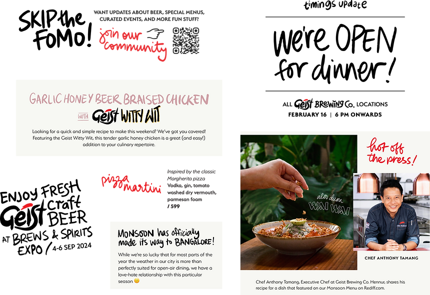
Hospitality Marketing
Provided creative direction and design for all three Geist Brewing Co. hospitality venues, including:
SEASONAL/FESTIVE MENUS & CAMPAIGNS


ENVIRONMENTAL GRAPHICS


CUSTOMER TOUCHPOINTS


Art Direction
Led art direction, visual planning, and production for:
-
Product shoots
-
Lifestyle and venue shoots
-
Social and campaign-specific content
I worked directly with photographers and stylists to ensure consistency with the brand’s visual tone. At times, I would post-process and edit images.


Website
I provided design and functionality direction to the external development team that maintained GEIST.IN. My role included design direction, wireframing, briefing, content structuring, and ensuring brand consistency across the site.


Point-of-Sale Material for Events
To support Geist Brewing Co.’s presence at large-format events outside its own venues (concerts, expos, trade shows, flea markets, pop-ups, etc.) I developed a modular suite of event POS assets.
These included both functional and decorative components for the brand’s beer dispensing kiosks. Designed to be mixed and matched depending on the size and format of event, these assets allowed the on-ground team to:
-
Quickly customise the kiosk setup for different footprints and event formats
-
Maintain strong brand visibility in dynamic, high-footfall environments
-
Deliver a consistent visual and experiential presence even outside Geist Brewing Co.’s own spaces
The system included signage, menus, backdrops, tap labels, and environmental graphics – built for portability, clarity, and impact.


New City Launch Campaigns
As Geist Brewing Co. expanded into new markets (most recently Kerala), I led the creative development of launch campaigns designed to introduce the brand with clarity, character, and local relevance.
Each campaign was grounded in a consistent Geist Brewing Co. identity, but included a visual or thematic twist to speak directly to the new city’s culture and context.
Campaigns typically included:
-
Visual extensions unique to the city (motifs, colour choices, layout elements) woven into the existing design system
-
Content direction for launch-specific social media assets
-
Onboarding materials for HoReCa outlets: tap decals, display installations, posters, tabletop menus, and other promotional material
-
B2B support decks for distribution partners and retail stockists
-
Retail display and in-venue kits to ensure amplified brand presence across locations
Each city launch was approached as an opportunity to build trust with trade partners and familiarity with new customers, while reinforcing the brand’s larger story of quality and intention.


B2B Communication
I developed a wide range of brand-aligned collateral to support both corporate and trade-facing sales teams:
-
For hospitality event sales: Pitch decks and venue profiles
-
For beer sales & distribution: Product catalogues, detailed spec sheets, promotional material and activations for retail, HoReCa, and POS
THE GEIST PATAKI PACK
One of the most notable retail promotions was a Diwali-edition 4-pack of cans with collectible packaging. We leaned into the Kannada word ಪಟಾಕಿ (“pataki”, meaning firecracker), which made the product instantly relatable to local liquor/MRP store owners, who are key gatekeepers in the retail distribution chain. It reinforced Geist Brewing Co. as a brand that champions local, while also offering an attractive seasonal product for end customers. The 4-pack stood out on shelves, supported by point-of-sale material, and was well-received by trade partners looking for a festive talking point. It was a strong example of how the brand’s design system flexes to accommodate timely, culturally grounded storytelling.


Investor & Internal Brand Collateral
While not publicly visible, I also contributed to internal decks and strategic brand presentations, including those for fundraising, partnerships, and new market entry.
Bits, Bobs & Miscellany
Over five years of producing work with Geist Brewing Co., not everything fell neatly into a category. Some pieces were small but mighty: an activation here, a carousel of long-form content there, or one-off graphics for impromptu experiments. These seemingly minor moments were what added texture to the storytelling, and made this a brand that showed up consistently and creatively, no matter the format.


TL;DR
-
Expanded the design system from draught-only to multi-format brand
-
Created a cohesive identity across 3 cities, 3 restaurants, multiple verticals
-
Built internal design muscle, systems, and tone
-
Helped Geist Brewing Co. feel human, local, and ambitious all at once
A Brand in Motion
Geist Brewing Co. was a brand in motion, and my role continuously evolved alongside it. Over five years, I helped shape a recognisable and adaptive identity with systems that supported speed, consistency, and character – systems that could flex across seasonal menus, city launches, one-off campaigns, new beers, and new audiences – while still feeling unquestionably Geist.


CREDITS
Original branding pre-2020
Vinayak Varma
Abheet Anand, Terrence Manne, Sanskriti Bist, Aiyaan Mohiuddin, Atul Pinheiro, Akshaya Iyer, Shameed Hidayathulla, Divija Khater
Web development
Everything Design
Additional illustration and mural art
Rae Zachariah
Additional graphic design
Akshaya Iyer
Animation
Sreejith T. M.