
CASE STUDY
MURUKOO
Brand identity and web design for a tattoo studio that’s part cat and part chaos.
SERVICES
brand identity, brand strategy, copywriting, content, graphic design, merchandise, web design
INDUSTRY
creative, lifestyle
THE CONTEXT
When Bruce, founder and tattooist, reached out, Murukoo was at an inflection point. The studio had built a solid following on Instagram and was really popular with its clientele, but its brand identity was still playing catch-up. The visuals didn’t reflect the spirit of the space or the team, which was warm, offbeat, and alive with creative energy.
Murukoo needed a brand that could grow with it – something flexible enough for physical signage, digital communication, and merch; distinct enough to stand out in a saturated market; and grounded in a story that felt personal.
THE APPROACH
It all started with a cat that never existed.
Bruce told me Murukoo was originally the name he'd planned to give a pet cat. He never got the cat – but he did get a tattoo studio. That spark of whimsy became the foundation for the brand’s personality: clever, independent, curious, slightly chaotic, and full of charm. Just like a cat. Just like Murukoo.

From there, the identity evolved into a full system:
BRAND STORY, PERSONALITY, & TONE OF VOICE
I ran with the idea that Murukoo is both a cat and a tattoo studio. The core brand idea became: “Murukoo is the spookiest of spectral presences, the guide to whimsical inky dreams, and the keeper of creative magic.”
This is a brand that likes to have fun, that understands the value of finding joy in small things like a cat finds joy in a cardboard box. So I shaped a tone rooted in curiosity, empathy, irreverence, and playful intelligence. Murukoo talks like your kindest, most creative friend, with just enough oddball energy to keep things fun. I wrote all the brand copy, balancing reassurance (especially for tattoo first-timers) with curiosity, humour, and a sense of mischief.
RESPONSIVE LOGO SYSTEM
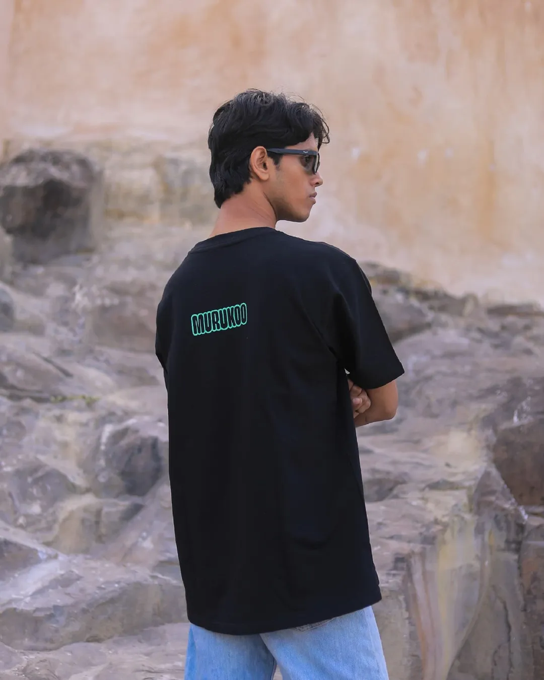
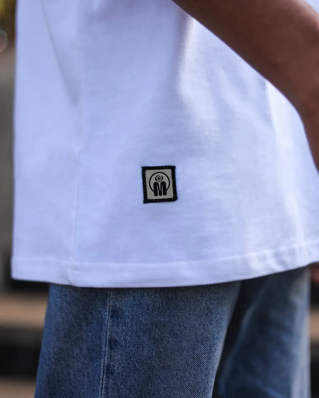
This identity really needed to stretch – from signage to stickers, invoices to Instagram. I designed a full responsive logo system to ensure clarity and presence at any scale: primary and secondary lockups, a shorthand version, and a watermark version.

I also created:
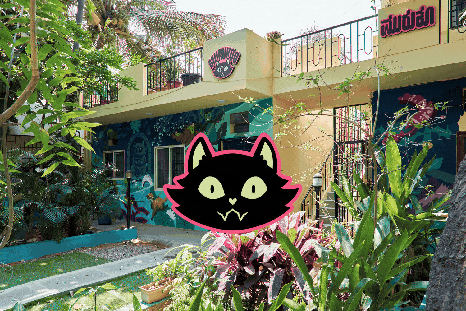
A Kannada version of the Murukoo logotype, for regional signage compliance in Karnataka state. Rather than treat this as an afterthought (as so many brands do), I took particular care to translate the character and rhythm of the original English mark into a completely different (and dissimilar) script. The result is a vernacular identity that doesn’t feel secondary – because it’s every bit as intentional as the rest of the system.

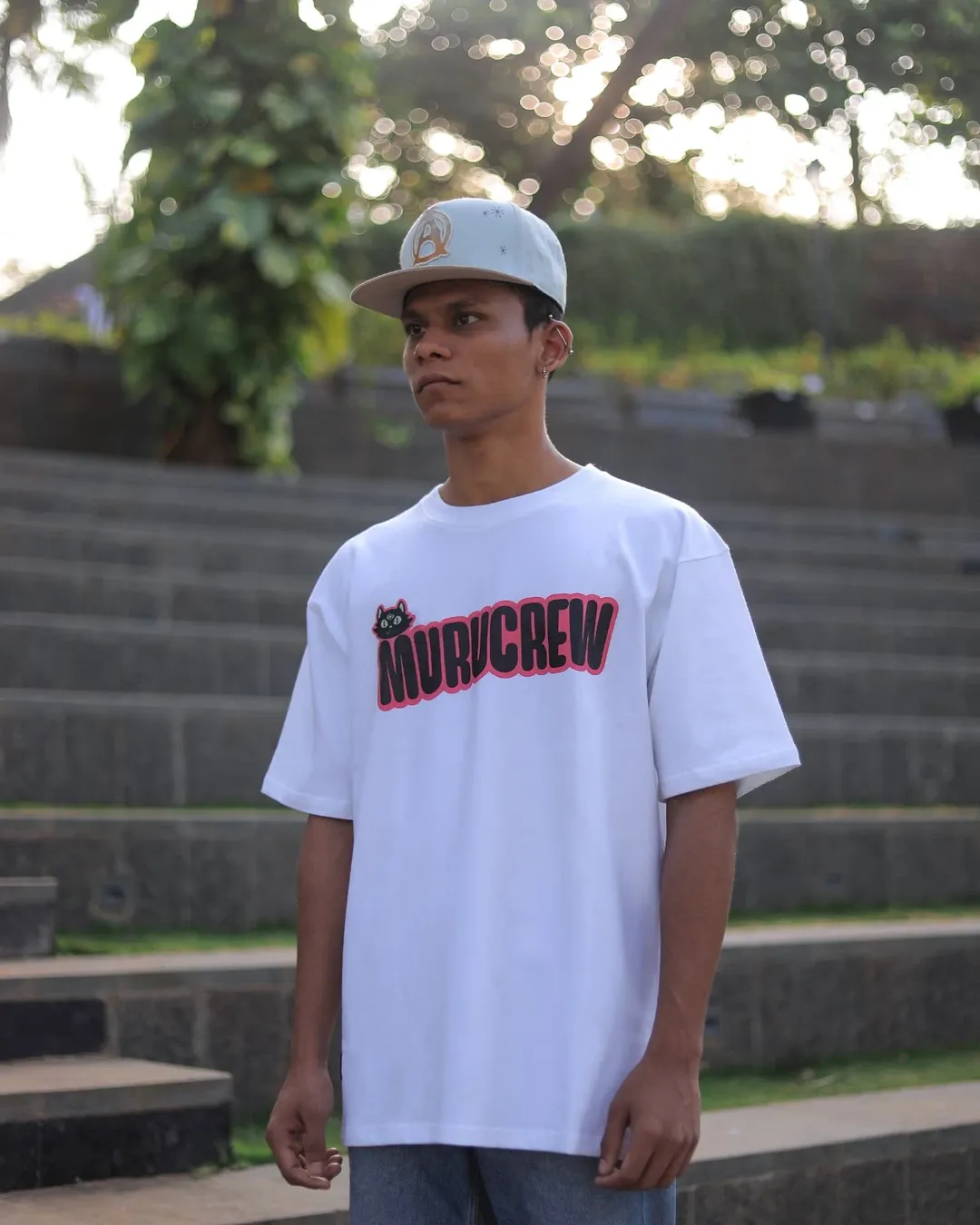
A ‘Murucrew’ logotype as an internal badge for the team, used in studio apparel and social content:


An animated logo suite (in collaboration with Sachin Bhatt) including a motion splash for Murukoo’s growing library of video content:
DESIGN LANGUAGE
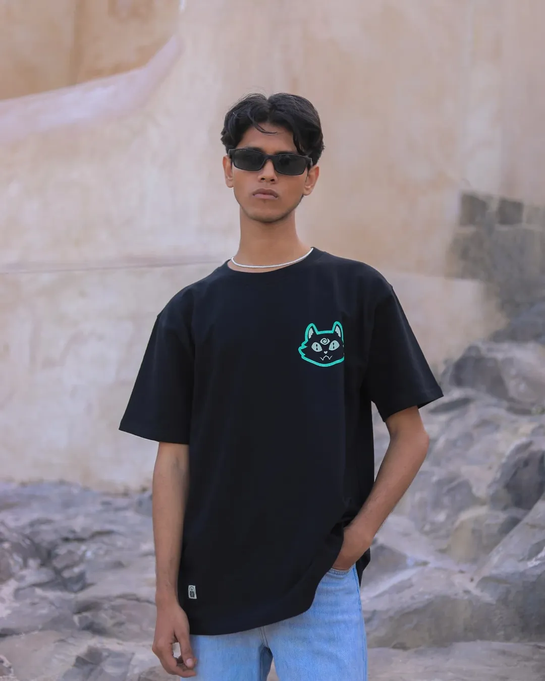
And, of course, cats aren’t just a metaphor in this brand – they’re the anchor of the design system. Cats are famously physically expressive: arched backs, pinned ears, wide eyes, coiled tension, loaf-mode relaxation. This gave me a flexible visual toolkit to build from. We turned the Murukoo cat into a living mascot, illustrating it in dozens of poses that are playful, dramatic, sleepy, curious, judging, inviting… basically every emotional beat a tattoo client might experience. Bruce and I sat together and drew hundreds of cats until we had a whole library of poses.


The design language now shows up in:
The website, adding warmth and humour to tattoo FAQs and artist profiles
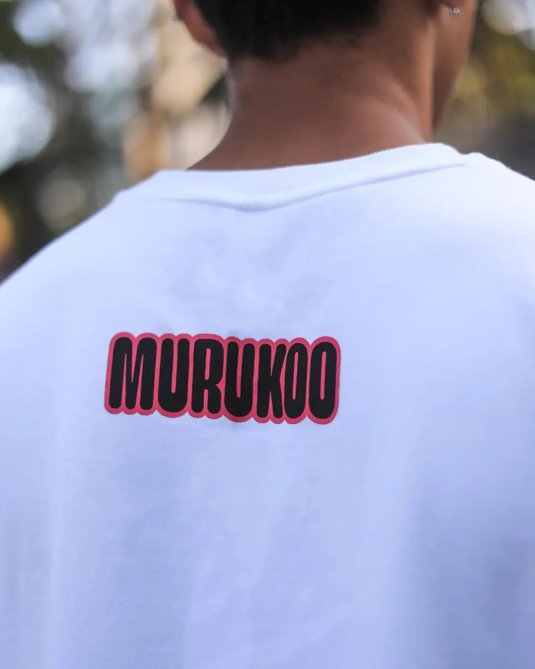
A wide range of merchandise, from enamel pins and notebooks to t-shirts for both customers and crew
The studio’s wayfinding signage, including what is possibly the world’s most charming washroom sign.


WEBSITE
The website is designed to be:
Educational for clients who are new to tattoos
Reassuring about safety, hygiene, professionalism
Clear about pricing, process, and aftercare
Personal: each artist has a dedicated profile, helping clients choose whom to work with based on style and approach.
Bookings are now streamlined via a clear form system, replacing an inefficient tangle of DMs and WhatsApp messages. The site does more than look good. It solves real problems for the team and their clients.
LINK TO MURUKOO WEBSITE
THE OUTCOME
A rich, responsive brand identity that reflects the studio’s creative spirit
A mascot with personality and flexibility, used across print, web, merchandise, and signage
Copy and tone that make new clients feel safe, seen, and excited
A functional website that educates, filters, and converts
An identity fully integrated into and plastered all over the physical space – including signage, merch, and a show-stopping mural by Rae Zachariah, in which she has reinterpreted the Murukoo cat as a deity and painted a shrine to it.

Murukoo is more than a tattoo studio now. It’s a whole world in a cardboard box, and the cat is very much alive.
CREDITS
Sanjana Bhatt
creative direction, brand strategy, brand identity design, web design, graphic design
Sachin Bhatt
animation
Abheet Singh Anand
photography, videography
Rae Zachariah
mural
Dirty Hands Company
merchandise production & photography