

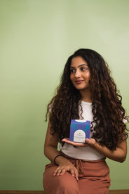
CASE STUDY
VEDAEARTH
How I built a packaging design system that helped this Ayurvedic aromatherapy brand stop blending in and start standing out.
SERVICES
packaging design, graphic design, styling, image editing
INDUSTRY
lifestyle
THE CONTEXT
When VedaEarth approached me, they had a very familiar packaging problem: too much sameness. With over 50 SKUs across skin and haircare, the products looked so alike that customers had a hard time telling them apart. While visual consistency can often be a goal in packaging design for a large product range, in this case, it resulted in a significant setback by failing to differentiate over 50 products in the market.
Worse, the brand’s core proposition of ‘Ayurvedic aromatherapy’ wasn’t coming through. The packaging felt clinical, flat, and anonymous – like something you’d find at the back of a pharmacy shelf. It didn’t evoke the luxurious, therapeutic, sensory experience that the products actually delivered, or the 'spa-like' feeling that the brand's founders were after.

THE APPROACH
I proposed a shift from designing for individual SKUs to building a scalable packaging design system.
Designing a system, rather than one-off artworks, ensures long-term consistency and flexibility. As a brand’s range grows, a thoughtful system makes it easy to extend the design language across new formats, ingredients, or benefits. It strengthens brand equity, simplifies internal workflows, and creates a more recognisable presence on the shelf.
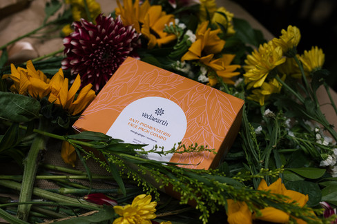
With that in mind, I developed a modular visual system based on a mix-and-match combo of ingredient-focused illustrations and colour coding by range. Each SKU was treated as a character within the same visual universe – united by structure, but distinct in colour and illustration. Hand-drawn botanical elements brought in tactility and charm, while a consistent layout maintained cohesion.
The system was designed to be flexible – whether VedaEarth expanded by ingredient (e.g. vetiver, lavender) or benefit (e.g. calming, clarifying), the design language would hold.
THE OUTCOME
56+ SKUs redesigned with clear product differentiation
Packaging that evokes calm, care, and quality, aligning with spa-like positioning
A scalable visual identity ready to accommodate future growth
Stronger shelf presence, clearer product navigation and stronger brand recall at retail


CREDITS
Sanjana Bhatt
packaging design
The Satori Studio
photography, project management
Savani Godbole
additional design and illustration